Bleepify it!

About two years ago I built a prototype for a web page that would convert any website into music.  As a prototype, it was very ugly and only worked in a few browsers.  I got busy and forgot about it... Then just a few weeks back I uncovered it.  To my surprise, I found that most modern browsers now support the technology.  So I gave it a face lift and, well, here we are:

Bleepify it!

My favorites pages to try it on are Youtube and Reddit... I guess I like structure...

I also enjoy how the control bar will convert itself to music as well...  Serves as a nice coda to button everything up.

Anyhow, enjoy all the bleeping-blooping!

Progress as a Liquid Dancer

So I've been doing a lot of liquid dancing lately. Apart from going to a few raucous parties now and again, I've been trying to contribute back to the scene that has given me so much. I have been developing a tutorial series on the fundamentals of liquid:

I get some really amazing warm feedback from posting these from people who are intensely interested in the same stuff that I am. It also helps me strengthen my technique when I force myself to ponder these typically non-linguistic ideas and articulate them for others.

Also, I've assisted a friend with a project and co-authred his paper on liquid dance and HCI:

It all started when Diego contacted me about questions about the Lumarca project. We got to talking and hit it off and I learned that he was really into Laban Movement Analysis, which is a very cool way of trying to capture and describe movement from an academic perspective.

Anyhow, we hit it off very quickly and I kept trying to force down his throat this idea that I had, which was that whenever the true 3d interfaces of tomorrow make it to our living rooms, the people who study liquid will be the power users. Further, that anybody building designs for 3d interaction should be looking at this community, because the fundamental principles that drive this form of dance are perfect principles for designing elegant, efficient, beautiful, and natural 3d interfaces.

Anyhow, one thing led to another, and now this counts as the second masters thesis I've inspired! : D (The first being Matt Parker's on the Lumarca at ITP).

So yeah, just wanted to share all of that. HCI people, meet liquid people. Liquid people, meet HCI people. I have a feeling y'all will be a match made in heaven someday...

Me + Internet = It's Complicated

I took a little over a year to rethink my relationship to the internet as an artist. It's given me some amazing emotional rushes. It has also contributed to some rough times. Here's what I've discovered about me, my work, and the internet.

Being "Right"

Before I get into "me + something else", I want to first review who I was when I started this new media art journey.

Just outa college, I was motivated by one thing: being right. It wasn't money, power, social good, raising awareness, or anything like that; for better or for worse, I was mostly only motivated by "rightness".

To me, being right meant designing things the right way. In terms of process, it meant that I wanted to itch away at a riddle until I unraveled it's definitive mechanic. Once I was confident that I'd cut away all the fat and left nothing but the core solution, I used that answer as a foundation to construct the logical hyperbole of that idea. This was a tedious process -- as most creative processes are.

To assist in this tedium, I needed some tools. I needed a way to record my journey. I needed a place to workshop my thoughts. I needed a stage to exhibit my finished work.

The internet was my toolbox

The internet fit all these needs. It was my diary, my community, and my gallery. I could vent my frustrations and record my insights. I could contemplate my progress, share my ideas, get feedback, and present to the world.

It was a good toolbox to have... I felt well-equipped to test wildly outlandish ideas because I always had a trail of breadcrumbs if I needed to get back home. So what if my conclusions ended up being wrong? I had a paper trail, knew what I wanted, and had a pretty good sense of where I was coming from.

Then the Traffic Came...

The first time I was temporarily "internet famous," it was an absolute thrill ride. I was bouncing up and down and felt like a champ.

It was this weird sense of ironic glee; I knew sites like Reddit and Digg were just ridiculous popularity contests, but at the same time, like, dude, I mean... the top post of Reddit!

Looking back now I can see where I misstepped. While I was able to acknowledge the absurdity of the situation, I was not prepared to process it. There's this term that people use to describe websites that get suddenly popular and get swamped by traffic: "slashdotted". Slashdotted sites usually get taken down as soon as they become popular. My web content wasn't ever slashdotted... but I was.

What I mean to say is, my work withstood all the traffic just fine, but my psychology couldn't properly process all this newfound attention.

Internet Attention: AKA Hype

The thing about internet attention -- especially internet attention focused on potential future technologies -- is that it's almost entirely hype without any substance.

What I mean is, popular internet attention is the type of ruckus that emits from a crowd of people who are doing nothing but waiting to be excited. Hype is collective blind optimism.

And when I shared my work with the internet, on a few occasions it struck a chord with these people. Not so much because it was a practical solution to anything, but because it was absolutely "right" by it's own internal design.

I fell in love with the attention. I figured that the only way for me to grow was to lean into it. Instead of being an expert at my domain knowledge, I wanted to be an expert for the sake of this hyped up community.

Being "Right" on other people's terms

As you may imagine, this was a painfully terrible instinct to follow. While before any of this happened, I was mostly concerned with using "be right" as a motto to develop rock-solid designs, now I was trying to apply "be right" to other people's speculations about my work.

The problem here was that I didn't truly grok other people's issues like I grokked mine. The riddles I unraveled in the comfort of my own home were mine. They were elegant riddles that rendered elegant answers.

The riddles that the sea of internet gave me felt fuzzy and impossibly large. They involved politics, the future, and real-world costs. Instead of providing elegant answers to personal, elegant riddles, I was trying to provide simple designs for really big fuzzy questions.

Give up on solving other people's problems

Eventually I got so frustrated and felt so confused that I gave up on other people's problems. After all, I wasn't an expert on the things they were bringing up. I was an expert on answering my own questions.

This revelation was liberating in the sense that I wasn't beholden to anybody else.

But, on the other hand, it was confounding for a new reason.

If I wasn't interested in seeing these designs through to completion -- if I built these projects merely as design exercises -- did any of it matter? In other words, if my creative work has no obligation other than to just be beautiful, am I actually adding any substantive value? Or was I just stoking the fires of internet hype by feeding it what it wanted?

To be clear, I stand by the work. It is good, and it's designed with a very deliberate, methodological approach. It was intended to be beautiful, and I think it accomplished that. But if I'm only adding to the hype, is it still worth doing? Does it, in the end, make the world a better place, or just a more cacophonous one?

So I took a break...

This whole journey made me sick and made me want to walk away from it all. I could feel myself wanting to publish things on the internet, but I could also feel that it became something ugly. Every new idea I started playing with felt like it was contaminated by this soupy confusion of stupid considerations like "I wonder if this would make a good post on Reddit" or "I wonder what sort of blogs would pick this up".

So I decided to stop and to abandon my desire to publish work altogether. At first it was just an emotional knee-jerk reaction, but by the time I realized what was happening, I thought it was kinda neat that my defense mechanism did that, and I rolled with the punch.

And I think I was right. After a while I felt healthier and better grounded. I felt like I got a better sense of what I wanted from the internet, and a more discerning eye when it came parsing the good from the bad.

And so now I'm back...

What I realized with my time away is that there's a "Right Way" to engage with the internet as a new media artist.

The "Right Way" is to acknowledge that the internet is an indispensable collection of tools -- at least for my personal creative process. It is a public journal, a workshop space, and a personal gallery.

The "Right Way" is to build ideas that, from the get-go, are related to the greater good of some community. And no, the community that is "Internet Press" doesn't count, because that community is just a churning hype machine.

The "Right Way" is to focus on those riddles, to unravel them, to expose them, and to continue to be relentless about their purity, even after other people engage with them.

I'm very glad that I took time away from this blog. I'm also glad to be back, to have access to those tools again, and to feel like I have a better, well-rounded understanding of how these tools work.

So I don't have all the answers right now, but that's okay. After all, that's what this blog is for -- a place for me to work out my confusions. Also, for the first time in a very long time, I can happily say that I'm relieved to not feel like I should have those answers.

World's Largest Volumetric Display Ever?

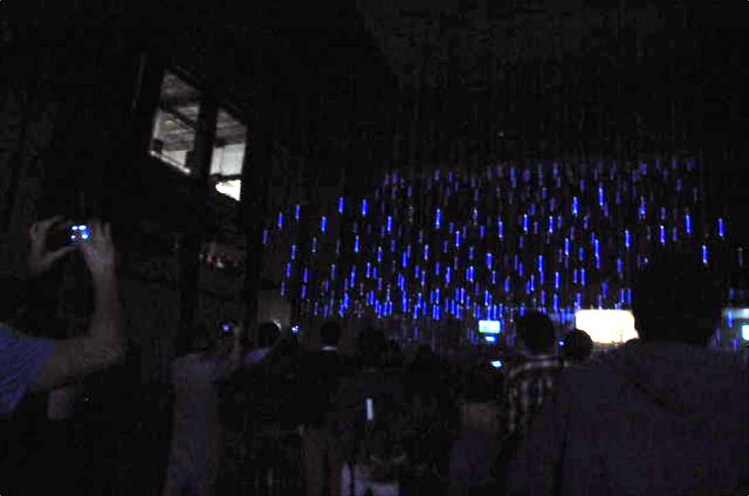
I just came back from a trip to Guadalajara where Matt and I built what I believe to be the world's largest volumetric display in history. As of right now, I don't have much documentation (clean good photos, videos); those come later.  I hope the images below give a good enough idea:


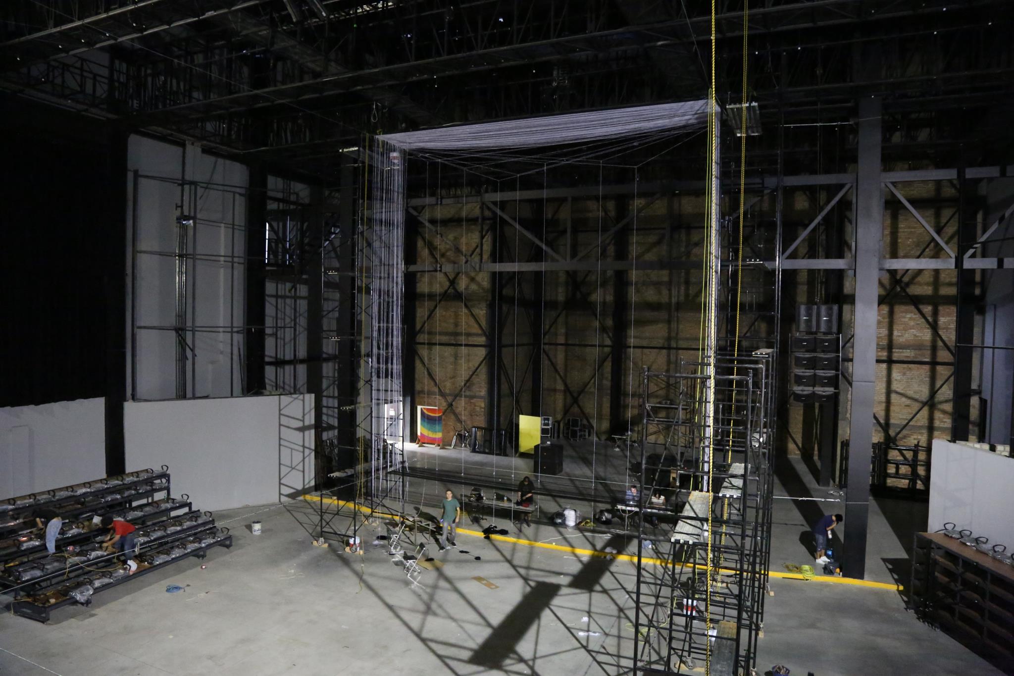
To give a better sense of scale, below is an image of the project early in the construction process (only about 10% strung):

It's big.

The structure itself is 40' tall, and 30' wide and deep.  The volume of the structure itself is 36,000 cubic feet (about the same internal volume of a 747).  The volume of the rendering size is roughly half that.  Still, much bigger than any other volumetric display I've ever heard of.


But this post isn't about the build process or the technical specs or the frustrations or fears.


I just wanted to write this post to express how happy I am right now.

In 2006 I developed a little idea that people seemed to love -- the idea of projecting light onto strings.  I made some prototypes, published some stuff on youtube, and got some attention from random internet people.  That's about as far as I was initially planning to push this idea.

At the time, I knew that, at least in principle, the idea could scale to fill up an entire theater.  When I had those ideas, I never really imagined that one day that would actually happen.

In some ways, this last installation was a dream come true.  A huge team of some really talented people rallied together to get this installation up and running.  While there were plenty of frustrations and set-backs, everybody's heart was in the right place, and everybody just placed their faith in my and Matt's vision.  A lot of the hired help probably had no idea what was happening while they were helping out, but they were really great, and when things got rolling, we were pushed through a whole ton of work really quickly.

And as soon as Matt and I and our whole team started reaching maximum velocity with work, one by one, other artists popped up and started setting up their projects.  I was so neck-deep in Lumarca work that I didn't really have time to engage with other people's work or process until just before opening, really.  As soon as I finished the Lumarca work, I looked around at the other work and realized that the whole theater had turned into a digital garden with so many interesting projects.  Only then did I realize that this was going to be a damn fine show and that we all had something to be really proud of.

The most touching moment was when the doors opened and people started flooding in from the streets of Guadalajara.  I was told that 1500 people came to the opening -- a number that far outdid anybody's expectations.  I got the sense that the whole city had been patiently waiting for something like this -- as if the city let out a sigh of relief -- as if all the closeted media arts geeks of Guadalajara came out of hiding at the same time and realized that there was definitely space for them here in this town.

I am so grateful that I was given the chance to share my work with so many eager minds and bright faces.  I'm really proud of my work and on the potential impact that I've had.  I think everybody at the festival (artists, administration, crew, security, volunteers) should be proud of the entire festival.  I really don't think I'm fantasizing when I say that we've helped reshape the cultural landscape of Guadalajara.

Lastly, I wanted to share few things I'm thankful for:

  • That Matt Parker guy
  • Everybody's faith that this would all work out in the end
  • Marco's family for extending the invitation out to Tapalpa
  • Every last staffer at MOD, but especially:
    • Margarita Sierra
    • Marco Antonio Castro
    • Juan Carlos Robertson
    • Janet, Sandra, Susana, Augustine
    • Octavio, Oscar, and the whole crew
  • Everybody at Larva, especially:
    • Alejandra
    • The people behind Cafe Bonito & El Menu Del Dia (Yum!)
    • Security
  • The crew
    • Arturo
    • "Mi Hijo" Christian 2 y sus amigos (Especialmente Christian 1, Michael, Giovanni)
    • The students from CAAV (especially Jorge, Argel)
    • Horacio
  • My 3 years of Spanish I took in high school
  • And those skype calls with Morgan

ofxPortalCam - Viewing your monitor as a window, not a picture

ofxPortalCam is an addon for openFrameworks that allows you to use your monitor as if it were a window through which you could see 3d content.  In other words, it transforms your monitor into a digital diorama using the Kinect for head tracking. [youtube]http://youtu.be/9hOUw3zqobc[/youtube]

Here's the project in a nutshell:

1) The Big Idea

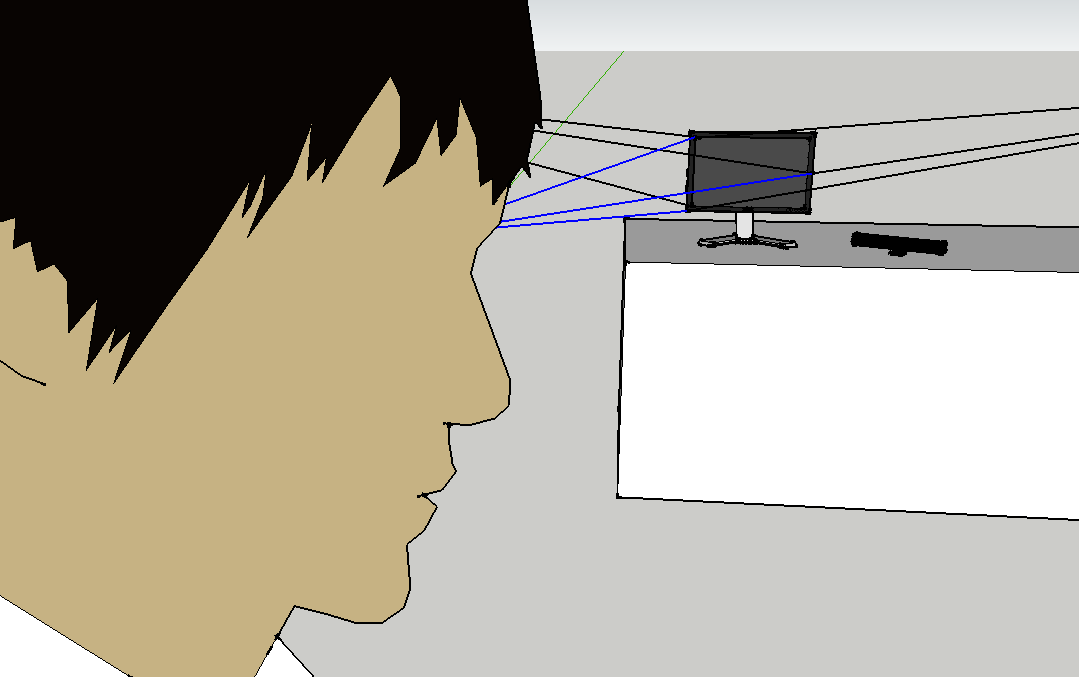
A computer (that is hooked up to both the Kinect and the screen) gives the viewer an image based on these three different things:

  1. where the viewer's head is located
  2. where the screen is located
  3. the shape of the digital scene

With this information the computer knows what image to present to give the viewer the illusion that the screen is a portal into a 3d space.

2) The main problem: Monitor space and Kinect space

So, in isolation, I have all three criteria.  The Kinect gives me the user's head, openFrameworks defines where the screen is located, and the code I use to build my openFrameworks app defines the shape of the scene.

But there's one big problem.  The Kinect is defining everything according to one perspective, and openFrameworks is telling me everything in another perspective.  In other words, the location of my head according to the Kinect doesn't correlate to the location of my head in screen space.  So we need to do some calibration so that we can translate back and forth between the two types of space.

3) The solution: The Human Body

Luckily for us, we've got bodies!  Bodies are awesome for this purpose because they (A) can be tracked by the Kinect in Kinect space and (B) can define the location of the screen by assuming poses.

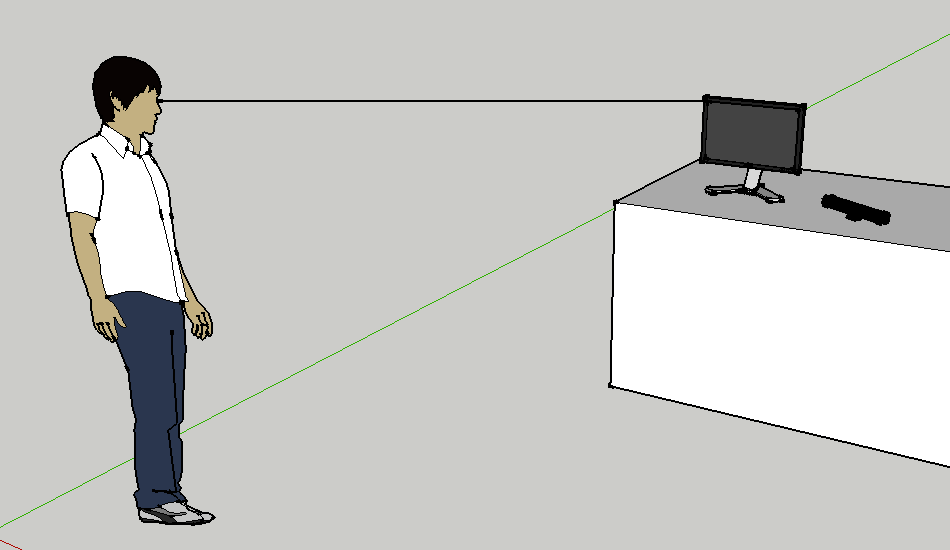
The calibration process works like this.  The screen presents a dot.  The user puts their hand between their eyes and that dot.  Once there, the user presses a button.  A program then uses the Kinect to record the shape of their body.  This creates a line that extends from the head out through the dot towards infinity.

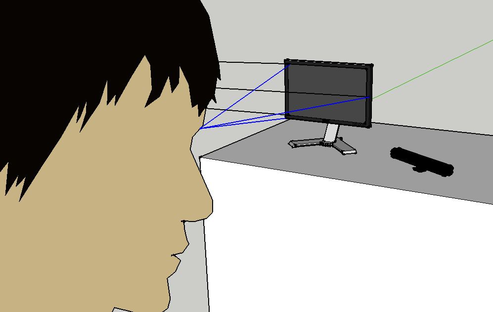
This is done three times on different parts of the screen to complete one set of calibration points.  The points are: top left, right, and bottom left.

Once these readings are taken, we define a few other sets of points.

4) Moar Datums!!1

Here's the second set of calibration points:

And the third:

Note that every time a set of calibration points is taken, it's from a different place in the room.  Also note that from each set of points, it's always the same three points on the screen: the top left, right, and bottom left.

5) Boil down the data

Once you do this a number of times, you have a really useful dataset.  The data is defined in Kinect space (built off of the geometry of your body), but it describes the location of the screen!  When you put all the data together, you get a bunch of lines that all intersect in 3d space at three discrete points.  These three points define the plane of the screen in Kinect space.

ofxPortalCam then takes this plane definition and gives developers tools that allow them to easily translate from one space to another.

6) So Now What?

When you have the screen defined in Kinect space, it means that you can do some cool transformations to make it look like the screen isn't even there -- like it's a portal into a digital space.

The best part about all of this is that it's an OF addon -- so if you've got any interesting openFrameworks projects, they can integrate this addon and take a look at the project in a whole new light.

Game-based Goal Setting

If you want to watch (and not read): [youtube]http://www.youtube.com/watch?v=LMvB8oP99fY[/youtube]

If you want to read the cliffnotes (and not watch):

I've got an Excel spreadsheet that graphs my progress on my goals.  A lot of the design is inspired by my experience playing video games.

With video games, rewards are clear.  This is because success and failure are clear.  Additionally, games give you consistent feedback to affirm or discourage behavior.  One of the simplest forms of feedback is the visual feedback known as a "bar" or "meter" (like "health bar" or "experience meter").

Clear rewards makes life better : )

I applied this sort of reward system in my life by creating some goals and visualizing my progress with this excel sheet.

Goals-Template.xlsx

*Note -- it's only tested to be compatible with Microsoft Excel. I'm quite certain it doesn't work with the google docs spreadsheet reader. Some features work with Open Office, and some don't.

This spreadsheet tells me how far along on my goal I've come.  It also tells me how far along my goal I should be according to a pace set by my start and end dates.

Download, share, innovate.  But if you innovate, send me back a copy!