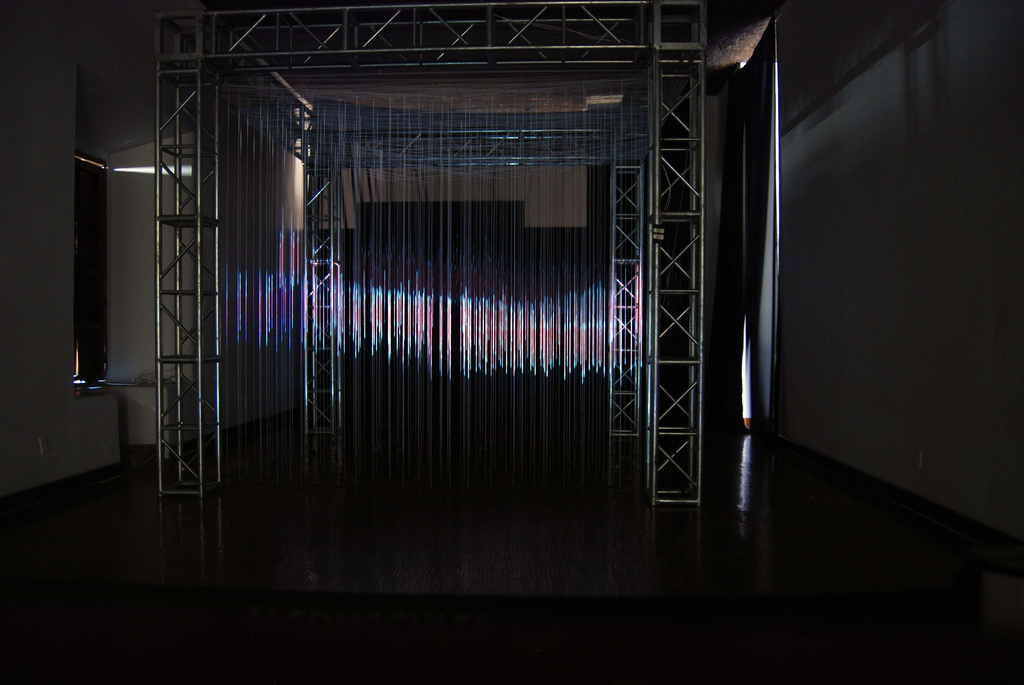
Spatial Computing 3!

Spatial Computing 3 has finally arrived! [youtube]http://www.youtube.com/watch?v=-2I4tVuuEQE[/youtube]

First and foremost -- thanks goes out to every single person who helped out.

Second, if you're unfamiliar with the project and want some context, read more about it here.

As you should be able to tell from the title of the video, SC3 is about using the Spatial Computing paradigm as a way to reinvent the home theater system.

While the video does feature a bunch of interesting ideas, the crux of the video is the ability to scale what you're watching with a simple gesture. This gives the user the ability to watch the content at any size, whether that be in front of them or in the space around their body. It also is a nice way to transition and travel about in a digital environment with the use of a few simple gestures.

I'm glad I decided to spend the majority of this video talking about this concept because it's deceivingly complicated. When I set out to do this video, I wasn't sure if the "aquarium" idea would actually look convincing. I was surprised to find that it ended up working so well.

The most exciting moments of working on the project were when I would try out a new effect and it ended up working. Heh, what a relief. The times that I specifically remember was when I was working on the glowy intersection effect (whenever a 3d model intersected with the physical wall of the room). Took a lot of trial and error but I'm pretty happy about those little effects -- they really add to the visual story that there are two competing 3d environments that need to somehow synthesize.

I'm Speaking at SXSW!

Well, I guess, more accurately, I should say that I'm going to be speaking on a panel at SXSW this year.  The topic of conversation will be "Detached Messages: Immersive and Spatial Systems".

I'll be speaking alongside Adam Pruden, a smart dude w/ a background in architecture, who's involved with the Fly Fire project, which is a design for a volumetric display made of LEDs attached to mini-helicopters:

[youtube]http://www.youtube.com/watch?v=CnEN9B18v6Q[/youtube]

Here's a brainstorm of some of the things I am considering talking about:

  • Lumarca
  • Spatial Computing
  • Dancing and some of the physical frameworks developed around spatial media
  • The craft behind the magic of making things levitate and why this is relevant to spatial media
  • Why the "digital" is thought of as visually 2d, and how this expectation plays out

In any case, if you wanna hear about it all, come on through and watch me blab for an hour!

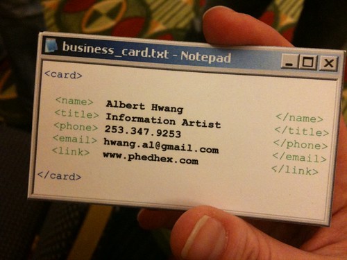
Re: My Business Card

Okay, so my business card blew up on the internet last night.  It climbed all the way to number 1 on Reddit, in fact!  Here's what I have to say in my defense to common critiques.

1) "Information Artist" is obnoxious and pretentious.

The first thing to clear up is that this is not a term like "code ninja" or "person who is actually just a front end dev who thinks he's an artist." I hate those people as much as you do. No, I probably hate them more.

This card is for my art career. This doesn't mean the card is NOT obnoxious (art careers themselves are, by my definition, obnoxious), but it helps explain what's going on here.

I do a lot of art work. I have a residency at an art and technology center. I exhibit my work around the world (*in fact, I'm exhibiting in NYC in a couple weeks!).   I give talks at conferences.  This is a serious title I give myself.

I will say that I have a difficult time pinning down exactly what it is I do, and "3d Information Artist" is the clearest way I've figured out how to do it. This is something I'm still working on.

As this card is for my new media art life, I need to cast a wide net. The tech art world is peppered with people who have never plugged in their own computer to people who code in assembly. While this is green-on-white console design makes me squeal with glee (as this redditor kindly mocked up below), I am not my intended audience. Museum curators, social media folk, internet art people... these are who I want to make a good impression on.

2) Well I'd never hire this guy!

I don't give this card out to people who are looking for employees. I give it to people who have connections to arts foundations and organizations. If someone gave me this card and wanted to build my website, I'd also not hire this guy.

3) Saving XML as .txt file will make your computer blow up.

Okay, but seriously, yes, I agree with the overall cringy-ness of that idea. XML should be stored in an .xml file. This business card is old, and the newest prints of my card do have the proper extension.

4) "I use Vim!" "I use Emacs!"

Well, apparently even Notepad isn't immune to this rage.

But seriously, who edits XML in Notepad?  Who still hangs around in Windows XP?

I chose XP Notepad for this card because I feel that its chrome is the most iconic digital imagery available. It is the least likely imagery that you will see IRL.

If you're wondering, in practice I use Textmate and E Text Editor.  Also, I rock Windows 7 and OSX.

5) Notepad doesn't have syntax highlighting!

Yep, I cheated. Deliberate choice. I mocked up a few cards that were all black and there was way too much visual clutter.  I was more concerned with connoting information than I was about the degree of accuracy of medium.

6) Whoa leading and trailing whitespace! Are you trying to tell me that your name is "        Albert Hwang      "?

: |

Fair enough. I will be honest that I didn't realize this until someone put it on Reddit. Not sure how to resolve this...

7) XML? Why not Json / YML?

I was considering making a shit ton of different designs and letting people choose when I gave them out. Including Mac and Vista and .... and then I got bored with that idea and gave up.

This is XML because it is the strongest and clearest visual imagery. JSON is too cluttery for those who don't know code, and YML too neat.

8) This is Photoshopped -- no print shop would be able to make those cuts.

I did these cards myself.  This is why the edging is so exact.  The card in this photo more so than many, actually.

I did find a local print shop whose technicians I'm sure hate this "Albert Hwang" guy.  The cards are no longer as exact as they used to be, but this is worth my time and money.

And now to stop focusing on all the negative feedback:

Thanks internet for making my day!  My friend Amber Case who took this photo (and I believe who is the owner of the mysterious thumb in the photo) tells me the photo got 600k+ 700k+ views!  Crazy!  If you want one, sign up for my mailing list.  I send out announcements on that thing whenever I travel or exhibit.  If we meet in person, ask for a card!

And lastly, my absolute favorite comment in the whole Reddit thread is a description of what an information artist is, by Redditor MindBleach:

Someone clever enough to come up with this idea, but not thorough enough to ensure it makes sense. (permalink)

It is spooky how accurately this sentence describes my life these days.

Update: Source File, if'n you want to make your own.

Eyebeam Residency!

I just recently became an honorary resident of Eyebeam!

Eyebeam is a new media art center in Chelsea. They do some really really incredible work, and it's been a blast getting to know the people over there. There's some really incredible work going on, and it's amazing to see it first hand.

I also hope to help out and to share some of my work and perspective w/ these fine folk. Dance classes? : )

Albert Muses Publicly on the Subject of Augmented Reality

A few weeks ago Daniel Cooper of Ball State University invited me to take part in a study he was conducting on the topic of Augmented Reality. He emailed over a list of very smart questions. Instead of writing out a response, I figured I'd post a video of my response. Here it is - me rambling on about some interesting topics from information design, 3d spaces, architecture, narrative, theater, etc...

Enjoy!